Selected work.
Sleeve Packaging
Client: Aurora Chocolate
My goal with this project’s art style was to subvert expectations, be surprising and exciting, but fulfil the brief. The client wanted some packaging that would stand out from its competitors and be full of energy. I designed this trio of chocolate sleeve packaging with a bright and fun, oversized graphic type heading, creating a unique illustrative element across the brand.
Restaurant Menu
Client: Payasa Lane
I created a very professional and sleek looking menu design for an informal bar & Mexicali restaurant, Payasa Lane. My aim was upmarket, with a little edge. I focused on hierarchy, so the layout strikes a balance between aesthetic beauty and contrast of a design but is also made legible. The colour palette I created has depth while looking fresh & modern.

Animal Stickers
Client: Lone Pine Koala Sanctuary
I designed three children’s stickers that feature illustrative characters of animals that live at Lone Pine Koala Sanctuary. For this project I used a cartoon style that would be playful for children, and I chose to add some simple line art to finish off the designs. I created these stickers using Adobe Illustrator.
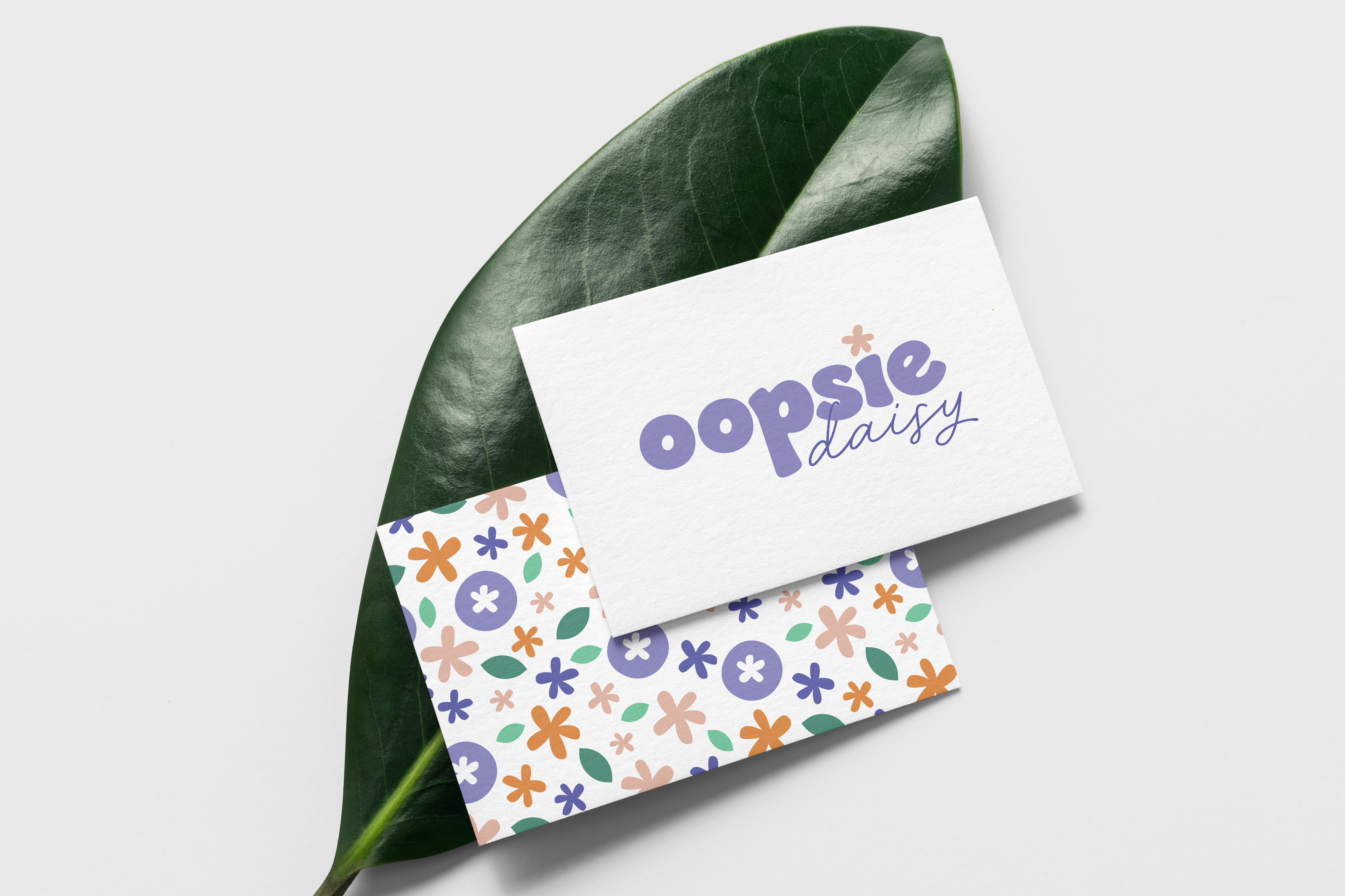
Brand Logo & Pattern
Client: Oopsie Daisy
My client wanted a fun and feminine logo for their new floral business. I created a combo logo with a blocked wordmark and special pictorial element. With my bright and playful colour palette and flower inspired illustrations, I created a repeated pattern for the brand to use on flower wrapping and other products.
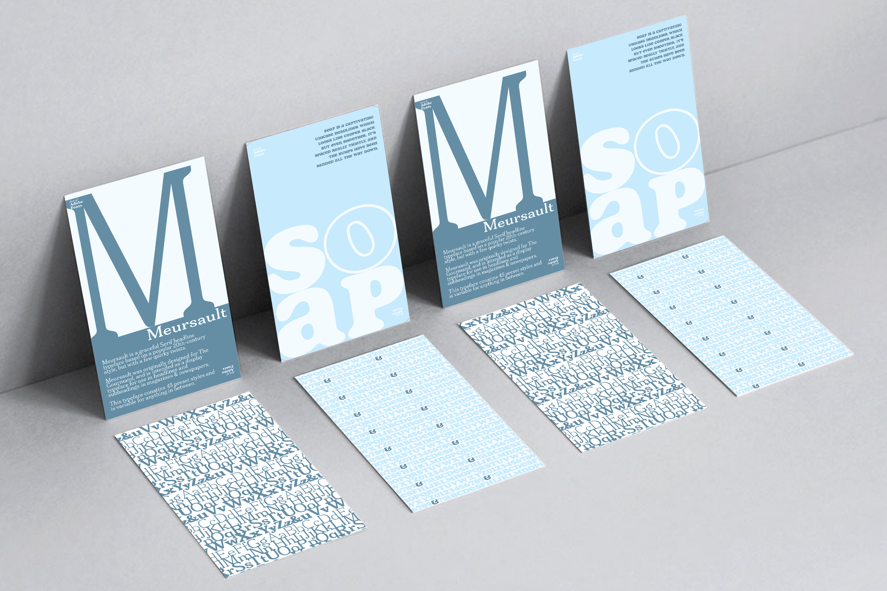
Type Card
Client: Flash Skills
I was approached by an educational game company and asked to create artwork that would be included in a deck of flash cards based on Fonts. I designed two cards based on the fonts utilising the style guide provided to me. I was able to create some simple and effective cards that express the style and attitude of each typeface. I also assembled a repeated pattern to present each typeface.

Brand Logo & Packaging
Client: Natures Candle Co.
This logo and candle label design was made for a company I conceptualized. The brand warrants simplicity with its natural and calm products being the focus of the design. I illustrated a palm frond and played with some typeface to create a clean styled logo that connects the target audience to nature.